I recently improved one of our landing pages at Rockstar improving our conversion rate by 500%. There are oodles of things that go through my mind when I'm redesigning a page. I covered a few in Part 1, and now here are a handful more.
People don't read what you write
Most sites put in an enormous amount of effort creating copy about their product for their website.
No one reads it.
You probably aren't even reading this. If I'm lucky, and you are reading this, you probably won't finish. 55% of people spend less than 15 seconds on something they click on.
It's not surprising. There's so much content now. Every morning I go through Twitter, Facebook, Apple News, Email, and App notifications before I even get out of bed.
I don't have time for your site and all the words you want me to read.
So just give me the headlines.
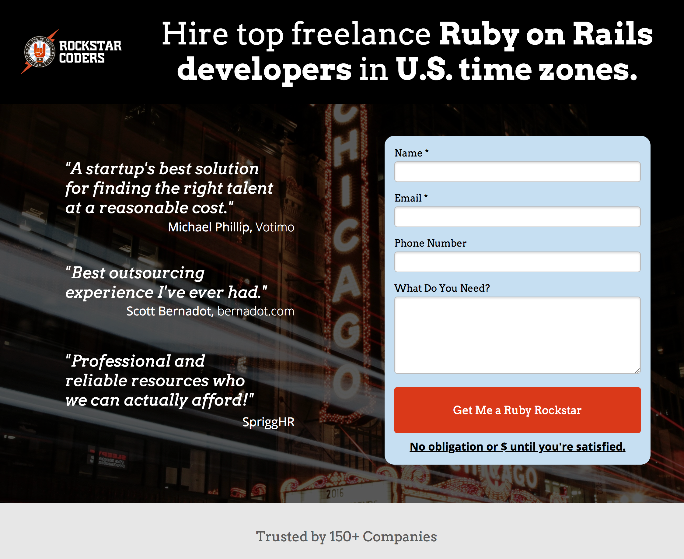
When I saw our current site:

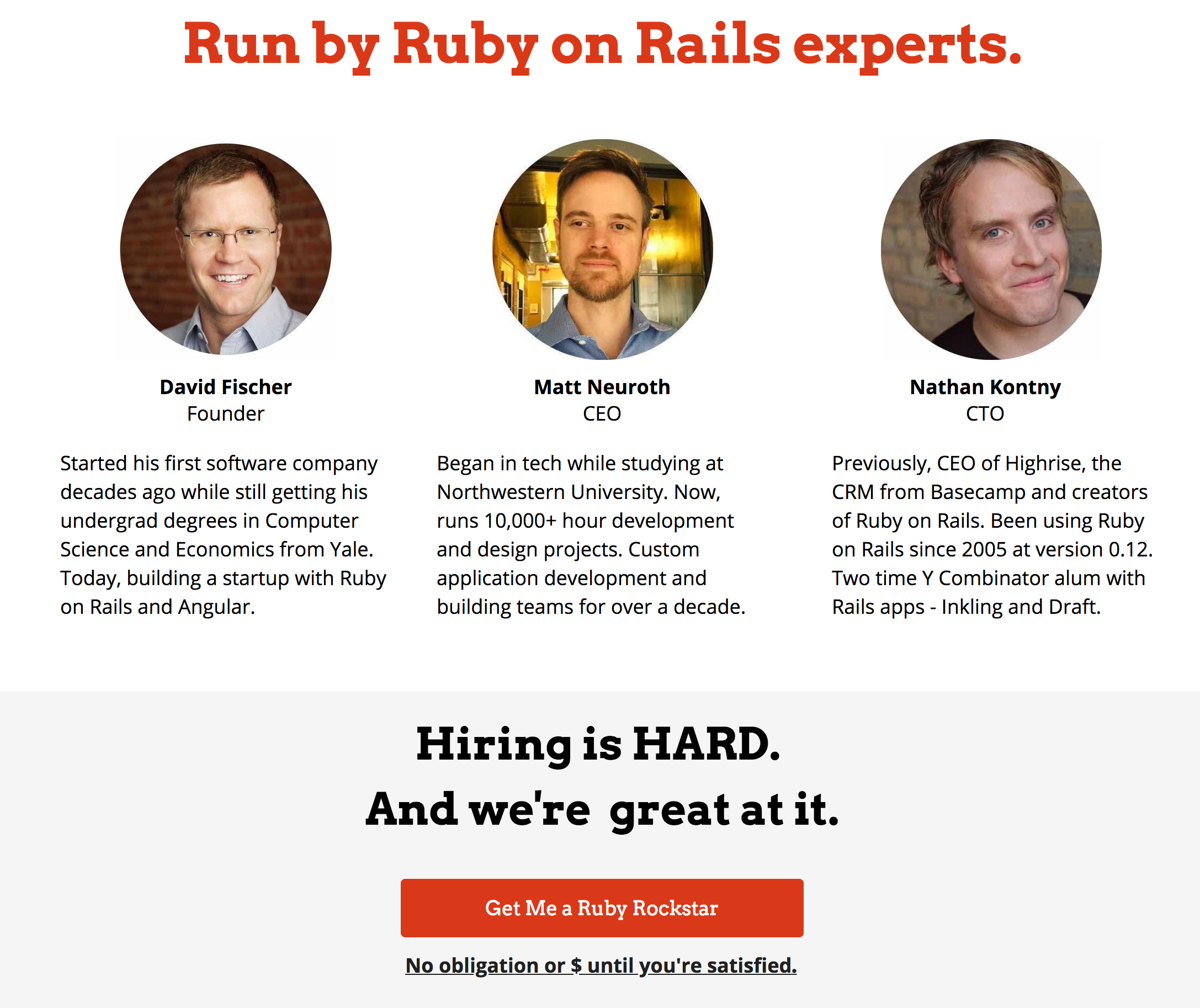
I totally get it. We're trying to convey why people should work with us. We help companies make software, and we're good at it, because our leaders like our founder is a CS grad whose been building software and his own startups for 20+ years.
But even what I just said is a lot of words, and no one is going to read them.
So I went through our entire site and converted all of our key messages into Headlines. Instead of a couple hundred words about being experts, it's now just a headline: "We're Ruby on Rails experts".

So anything that resembled a sentence or a paragraph was distilled into the most impactful headline or bullet point that conveyed the same message.
Other reasons we're great and different? Headline, headline, headline

I like to imagine... if someone came away from my landing page only having read a single headline or a single bullet, would that headline give them an inkling of wanting to work with us?
Don't waste your testimonials
People love social proof; they don't love reading long winded versions of them. Similar to the points made above, don't drown out your testimonials with too many words.
So I took the couple testimonials we were using before

and distilled each of them into a short, punchy sentence, and then added a couple more testimonials.

But you exclaim: "My client has said so many nice things about us!"
Great. Put all of that in a case study. Case studies are exactly where someone would expect to find lots of copy about how you helped a client successfully.
Landing page tools aren't helpful here
We've been using quite a bit of Unbounce. Great tool. Allows you to quickly spin up really great landing pages with minimal effort in HTML and CSS development. Great for testing ideas. But one problem...
And this is a problem all these landing page tools harbor: they don't replace the need to understand best practices of making great landing pages.
When I was looking over our previous landing page I found we were using a 30MB image in one section.

Even with our incredible advances in download speed, that's still an enormous file for a landing page.
I can see how easy it is to add though. Find a great photo on Unsplash, plop it in to Unbounce, and voilà. Beautiful. But those Unsplash photos are HUGE. And you rarely need that. In our case, it was an image greyed out on the page anyway. It doesn't need the full resolution copy.
Also, PNG uses lossless compression, but JPEG's are lossy. Meaning, PNGs are better but bigger. Do you need better? Would the JPEG look fine?
I've gone through our site making sure we're using JPEGs compressed as much as I can stand. My photo doesn't look as great as the PNG version. Who cares. It's good enough in this instance where speed is key.
So go through your site, study which images really need that high resolution treatment. And figure out which things can have a little less quality. Go with the worst quality you can get by with. Great landing pages need to be super fast.
Don't make them hunt the form

I like to have our form at the top of the page. But I don't trust that a new visitor is going to remember it's there. So I don't let people scroll through a landing page, get lost in trying to understand what we do, and then make them hunt to fill out a form with us.
I like to add call to actions throughout the page so that during the natural flow of reading a landing page, as soon as a form is probably out of sight, a new call to action back to that form is in sight. When that call to action is out of sight, another one appears.

You could get fancy and leave something hovering around while the user reads the entire page, but I've gotten by with just a couple CTA copies along the page.
Many more lessons from these redesigns coming soon. Stay tuned! A sneak peek: Don't Waste Your Time on Jobs To Be Done Interviews...