So, you just finished coding a brand new blog site for a client, including features to make the experience better for users. Clever menus that hide on scroll, messages that are dismissible to avoid obstruction of content, etc.
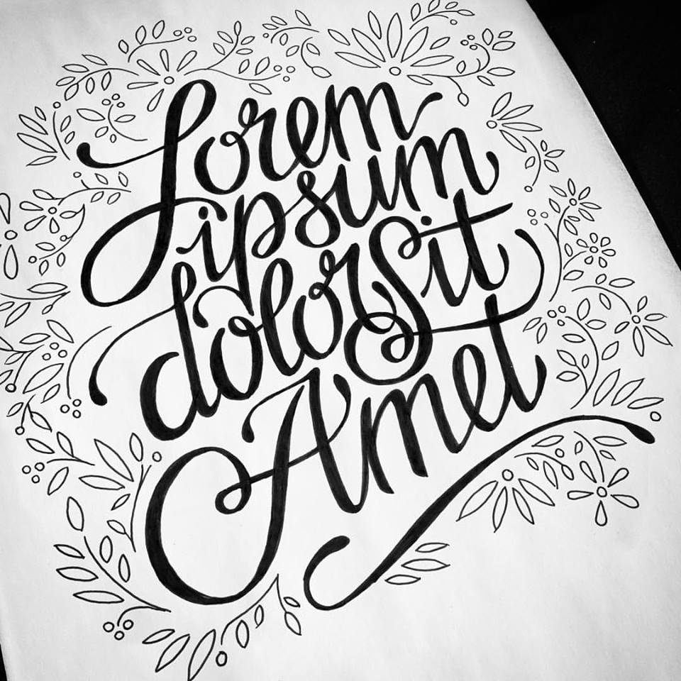
You scrolled through a few articles the client provided as test content. Bah, the client didn't have time to provide test content? No problem. Lorem ipsum generator here I go. Perfect.
Except...
Today I read an article on a prominent news site, and found myself annoyed by very standard features that most designers include nowadays on their websites:
- An auto-hiding menu bar, that showed on top of the first line I wanted to read whenever I finished scrolling for more content.
- A mega menu + subscription box that took 50% of the screen real estate, that I didn't realize was dismissible until I was half-way through the article. Instead I consciously found myself scrolling too often for more content.
- A fixed width content area, that wasn't perfect when I increased font-size as needed.
Here's a site I really wanted to read and the experience was miserable. How'd the designers and developers miss details like this? How can I make sure we don't miss details like this?
In 1988, a manager at Microsoft, Paul Maritz, sent a memo talking about how he wanted internal teams at Microsoft to use their own products more internally.
The title of that memo? "Eating our own Dogfood."
"Eating our own Dogfood" is now a commonplace phrase and philosophy for using the products you create so you can better experience those same products through the eyes of a real consumer.
Now, I love the ethos of "dogfooding" more than most. But here at Rockstar, we're a services company. Many of you reading this are in services. We make software for people that's often never intended for us to use.
But I've found a quick hack to get just a little bit closer to the experience Paul Maritz wanted his teams to feel.
Go to your favorite news source, blog or knowledge fountain. Find an article you haven't read yet, but you have all intention of reading today. Something that if a friend asks you later, "Hey did you read about XYZ today?" Your answer will be, "Of course I did!"
Next, instead of reading the article there, copy its content and as much of the markup as you can over to the new site design you're working on. Turn that article into a landing page, or blog post, or home page of your client's site.
Now, read that article. Still enjoy the experience?
"Eating our own dogfood" is ideal. But often in a services business we just can't. And of course customer interviews and usability testing are all well and good, but sometimes we just need to get a site design done without any more expense or labor.
We often turn to some "fake" content to fill in those sites. But we're hurting ourselves and our clients when we aren't as invested in these designs as our users are.
And while this exercise will not magically make you read the mind of your end users, it is definitely a quick and cheap way to getting yourself closer to that goal.
P.S. If you need any help building software, give us a shout. I’m sure we can help.