This site uses cookies to help provide the best web experience. Here's our privacy policy to learn more.
Continue

GRADING THE WORLD

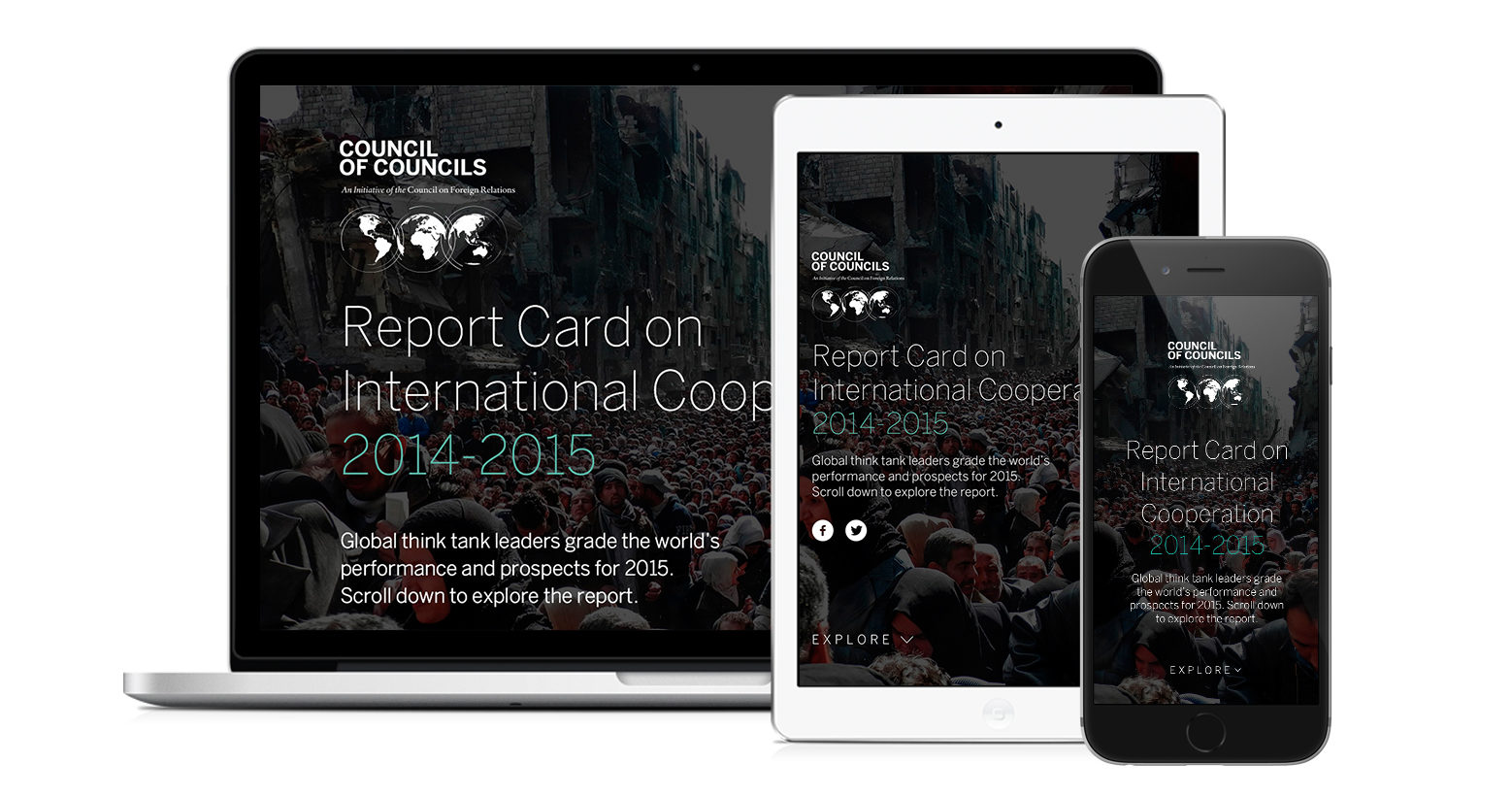
Through our longstanding relationship with the Council on Foreign Relations (CFR), we were introduced to the Council of Councils initiative – a network of leading foreign policy institutes from around the world connecting to have a common conversation on issues of global governance and multilateral cooperation. We were excited and honored to get the opportunity to work with these institutions from across the world to design and code the Report Card on International Cooperation for 2014-2015.

THE PROJECT

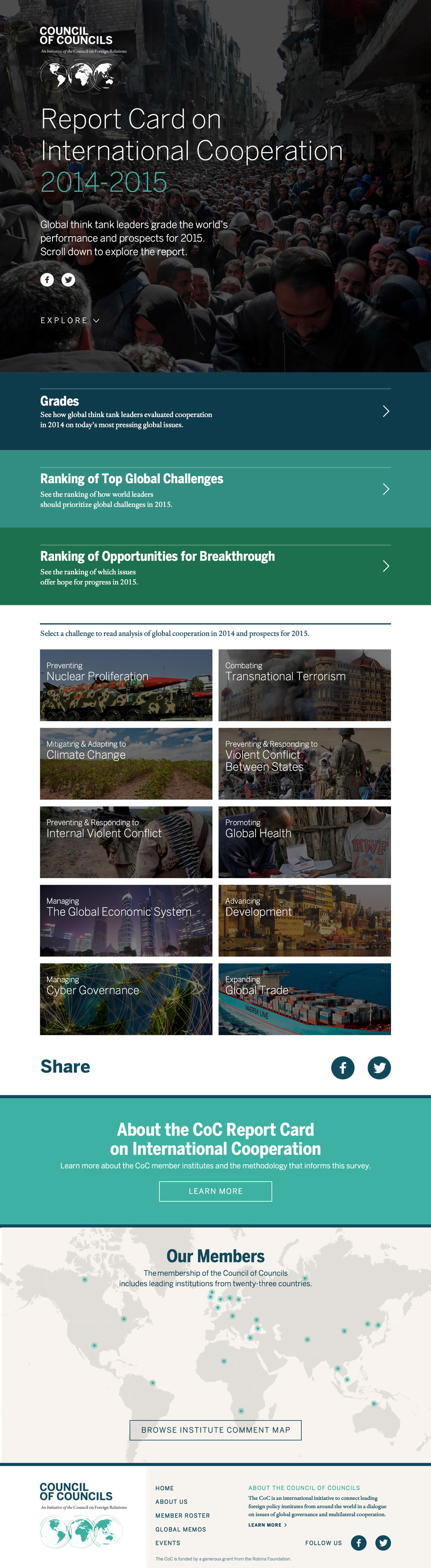
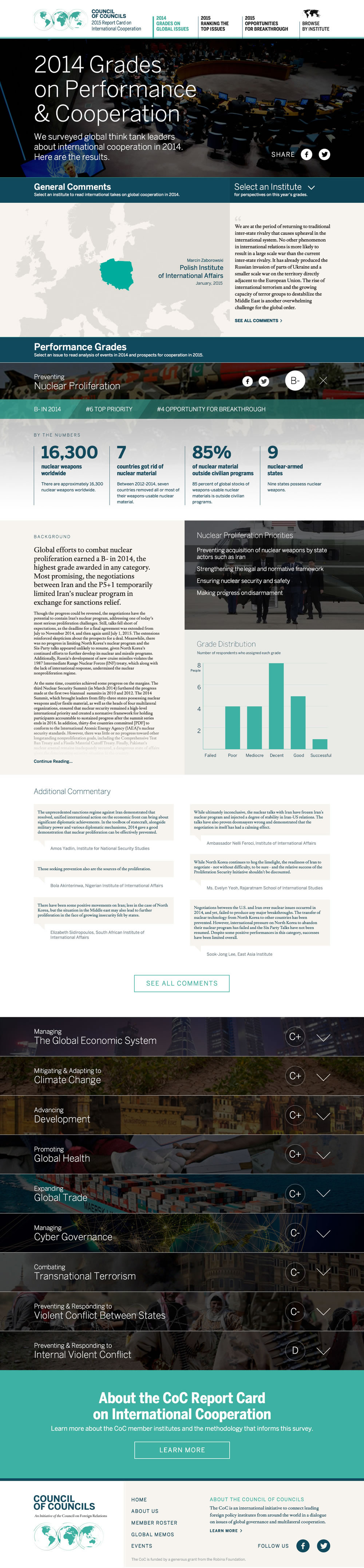
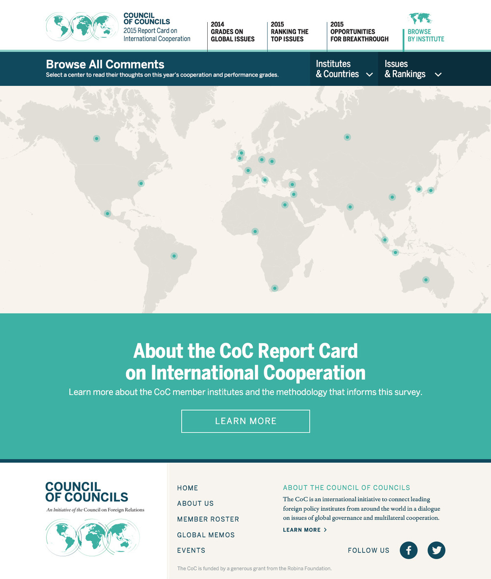
Each year, each of the 23 constituent institutions within the Council of Councils is given a list of global issues (in 2015, there were 10 total issues). From there, each institution submits the following analysis:

  • A “grade” on how the world did on each of the issues over the previous year
  • A ranking of the issues based on importance that year
  • A ranking of the issues based on opportunities for improvement that year
  • Commentary on the issues as seen from their institute’s perspective

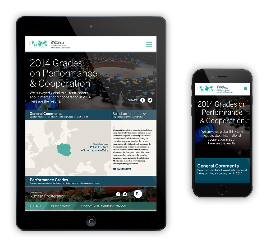
CFR collected all of the data from across the world and organized it into a report on the state of international cooperation in 2015. What they didn’t have was a way to share that data in a way that was engaging and informative.

REPORTING FOR DUTY

We worked with CFR and the Council of Councils to not only bring their data to life through engaging graphic design, but also create an immersive experience for the user.

This started with the imagery. The site leverages Reuters’ photography and an interactive map feature to help tell the story of each issue and contributing institution. We placed full-width images and tiles throughout the design to give the report a calm, contemplative look and feel so that the user could digest the plethora of information and analysis more easily.

We also wanted the user to be able to enter the site from one of many entry points and still be able to get to the same rich analysis. Users can view analysis by the three main metrics—2014 grade, 2015’s most pressing issues, and the issues that have the most opportunity for change in 2015—or by the issues themselves or the contributing institutions. Regardless of how the user chose to navigate the site, they’d end up with the same detail section for each issue, chock-full of overall rankings, analysis, grade distributions across institutions, and commentary from around the world.

Once we had the design down, all there was to do was create the report. We coded the front-end of the site and a dedicated mobile version. We even worked with the Council on Councils to create a 60+ page print version of the report.

We’re incredibly proud of the end product, and the reception has been outstanding; the site was featured on NPR and on Morning Joe when it launched. Just goes to show you what smart people working together can accomplish.