A GLOBAL APPLICATION
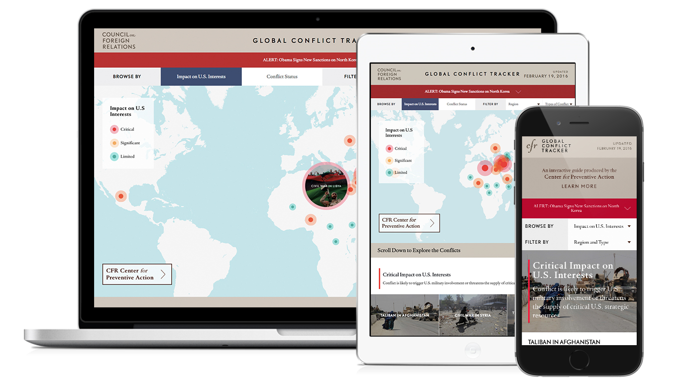
Our redesigned Global Conflict Tracker is a comprehensive application that allows users to navigate the microsite seamlessly and use the tool regardless of their entry point.
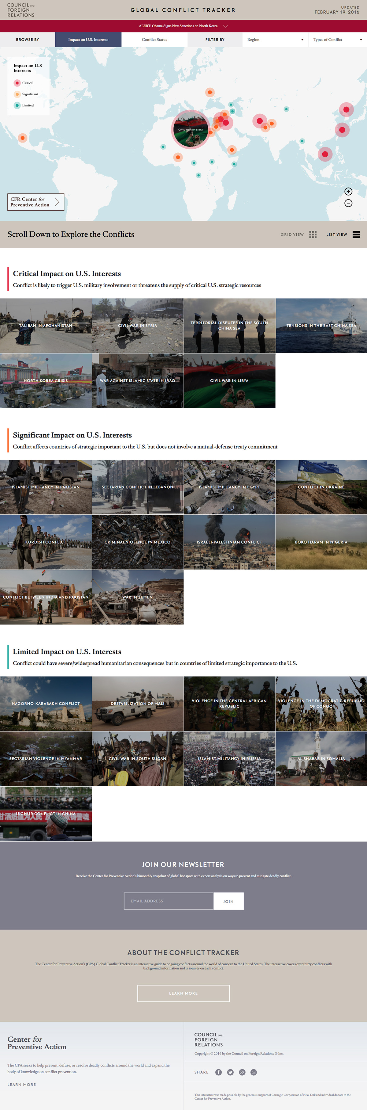
At the center of the microsite is the map, complete with color-coded conflict classifications. On this main landing page, the user can browse different views and filter the conflicts based on their interests. Whereas the old Tracker’s map was cluttered and hard to read, we gave each pin space and organized the site of the dots by importance. When a user hovers over a particular conflict, the dot expands to give a preview of the conflict and to make clear which conflict the user is selecting.
For users who wanted to navigate the site in another way, we also placed the conflicts below the map. These tiles, which can be viewed in either a grid or list, leverage the beautiful photography at CFR’s disposal.
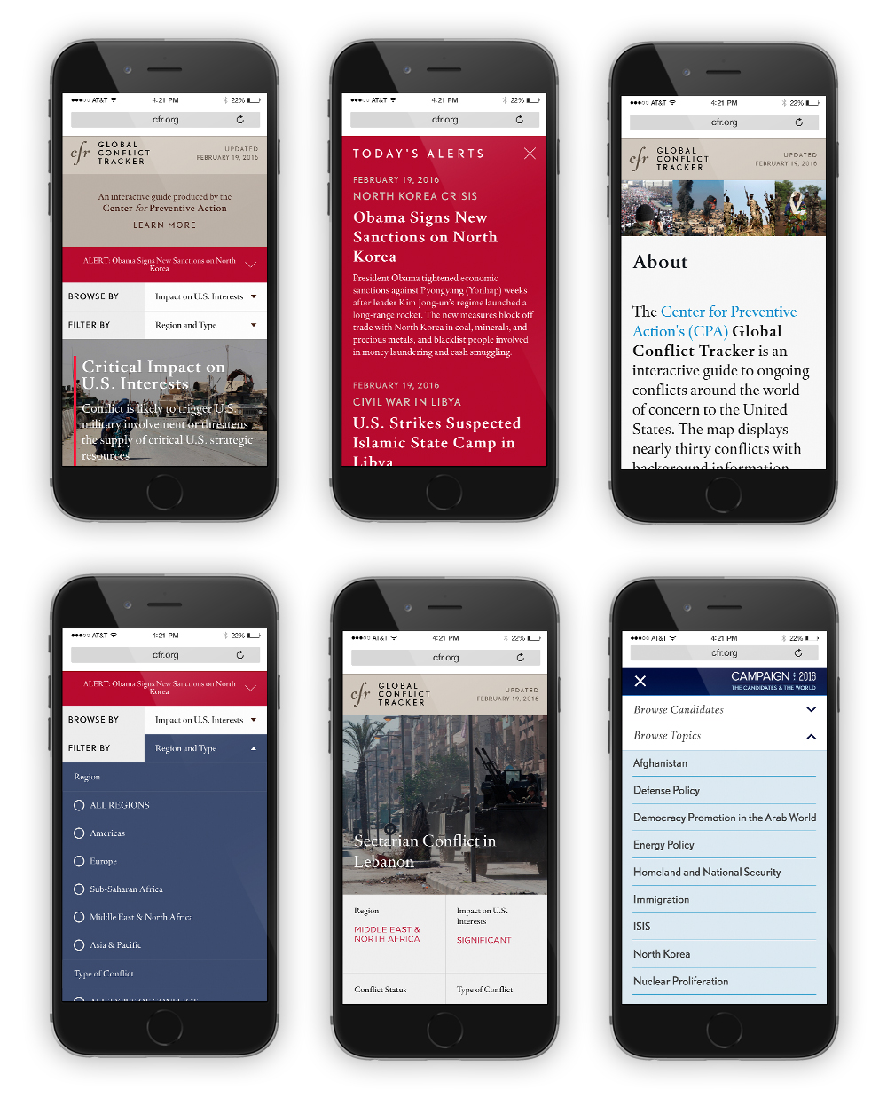
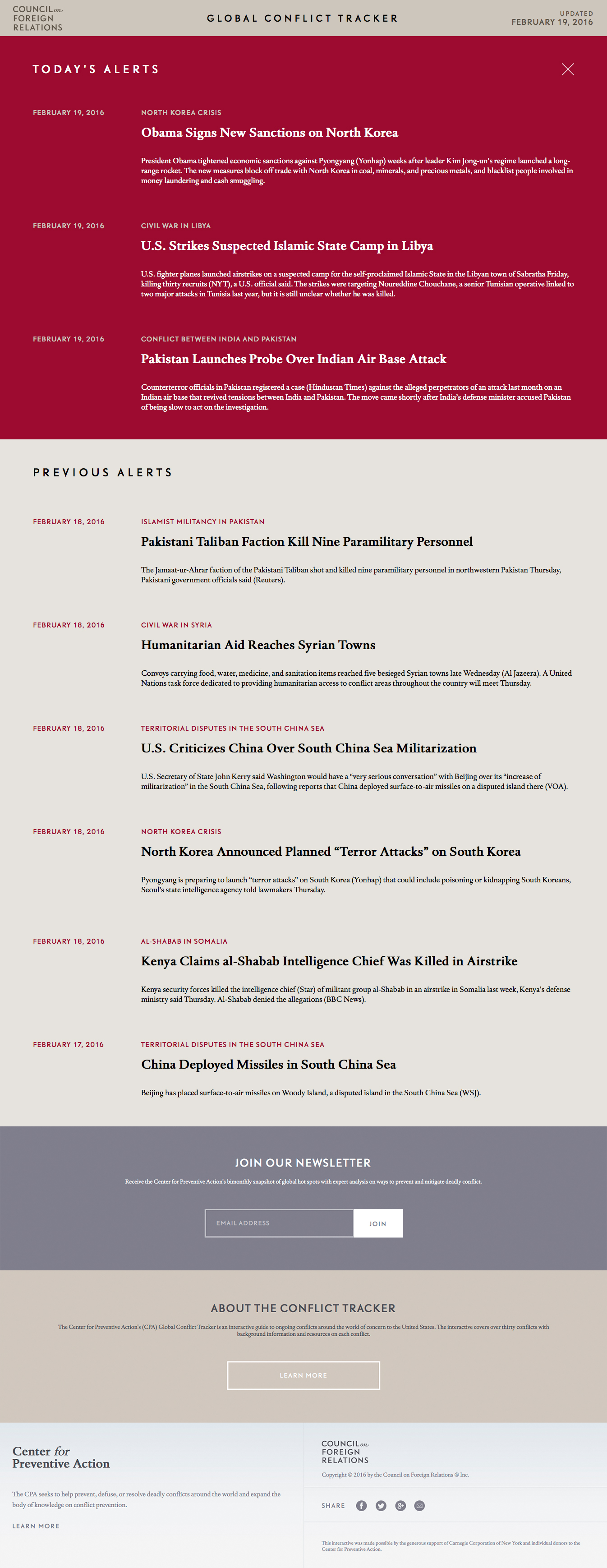
We also created an alert bar at the top of the map that CFR could leverage to tell users about the most recent conflict updates. When expanded, the alerts become an overlay where the user can view all of the breaking news for the day and older alerts for conflicts.
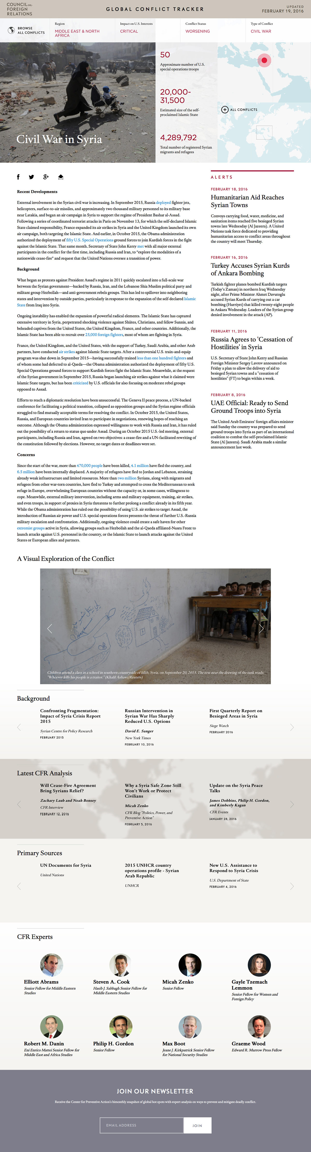
DIVING INTO THE CONFLICT
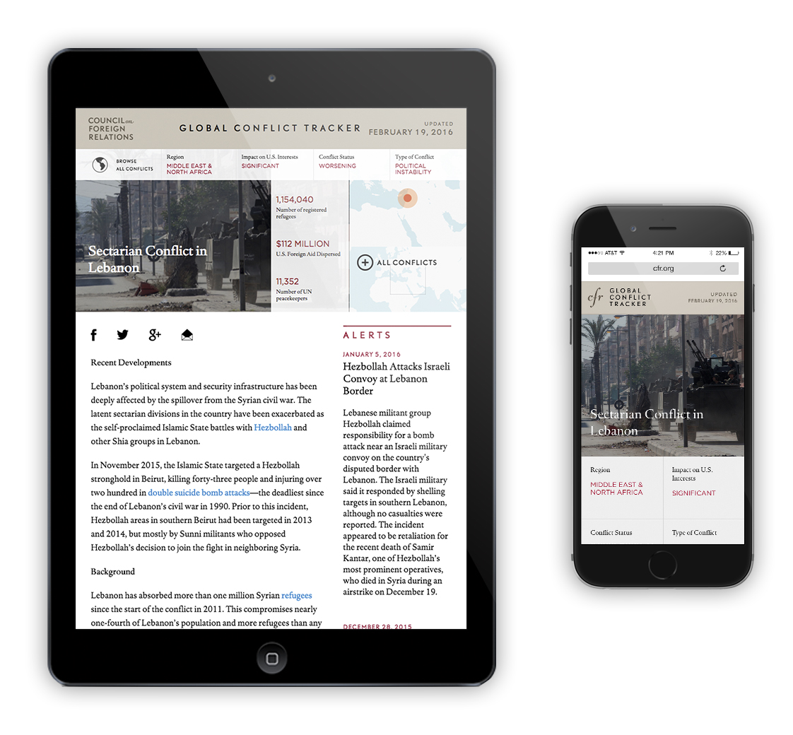
Once a user is looking at a specific conflict page, we wanted to promote CFR’s bountiful commentary in a way that was digestible and informative without overwhelming the user or making them feel like content was being forced upon them. We designed a spacious header section to match CFR’s contemplative tone and to give users the most important facts “above the fold.” We added an alerts sidebar to keep users up to speed with the latest crisis updates. And we made sure to point users towards other CFR analysis and experts offsite.
In order to promote further discovery, when the user scrolls to the bottom of any conflict detail page, they can continue scrolling and the homepage will appear as an overlay. As a result, you can easily get back to the main landing page and continue to compare conflicts without having to click to navigate.