I've been designing and building websites for 20 years. So when I recently joined Rockstar Coders, one of my jobs was to start whipping our landing page marketing into shape. I had a billion ideas of what could improve our marketing. And sure enough, some of those changes have gotten our conversion rate up 500%.
Here are a few of the design decisions I made along the way. Some of them will be obvious to you. Some of them won't. And I'm sure some of them are also wrong for one reason or another and we'll continue to tweak and optimize. But maybe one thing in here will spark an idea for your own work.
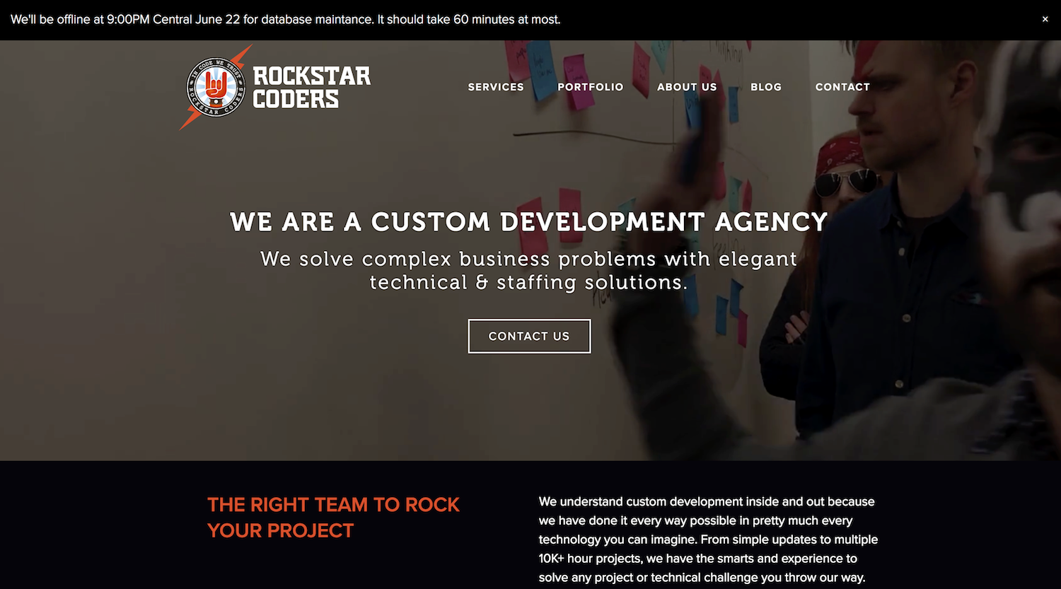
Don't leak
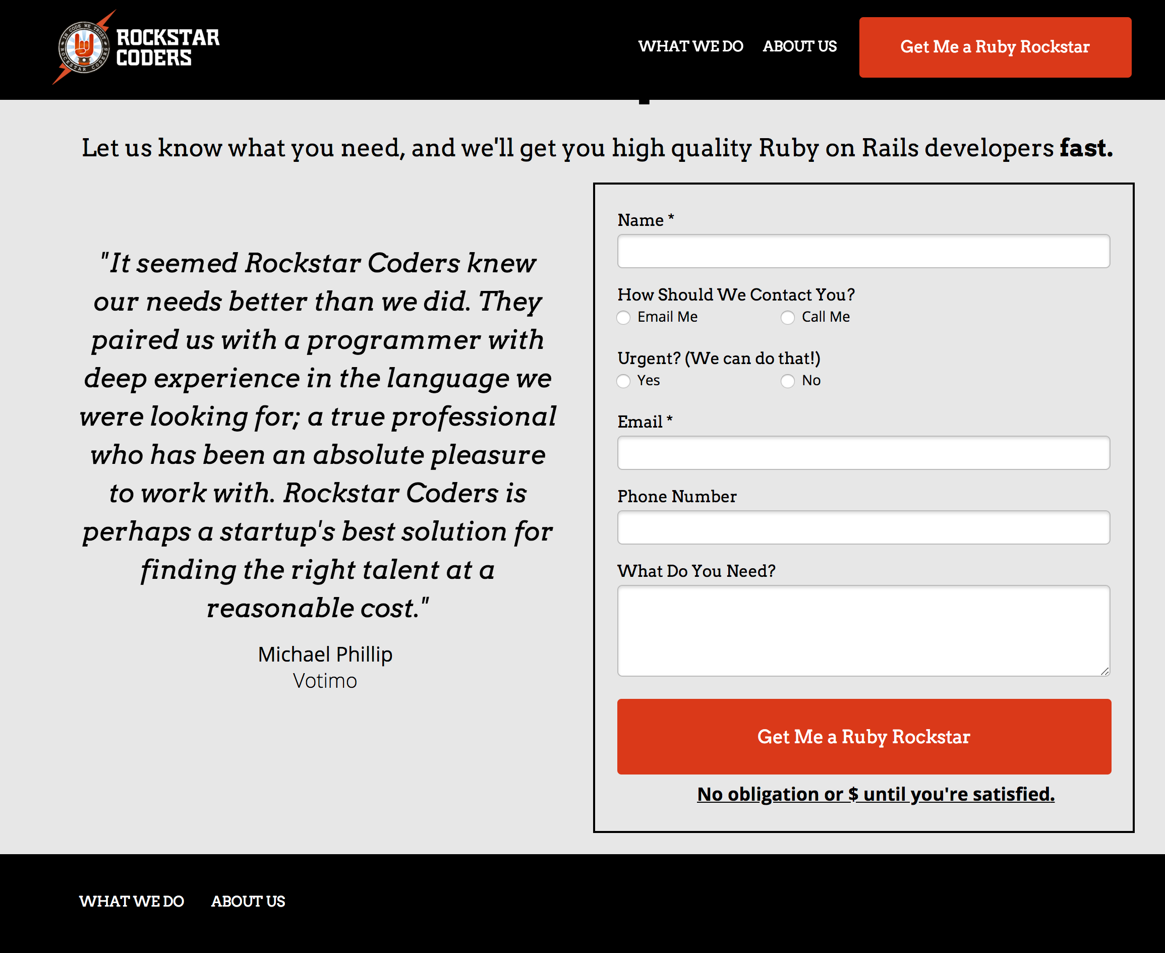
The landing page I inherited wasn't bad. But one of the first things I noticed was it had navigation at the top.

Navigation is great for a full fledged website, but for a landing page that gets hit from a Paid Ad, navigation is a leaky bucket.
Your landing page should have a singular focus. But with navigation, people tend to get lost in the weeds of your site and the farther from completing that singular focus: becoming a lead.
So I ditched all navigation at the top of our page. There's navigation at the bottom of our page if someone scrolled enough to get there and aren't yet convinced to contact us.
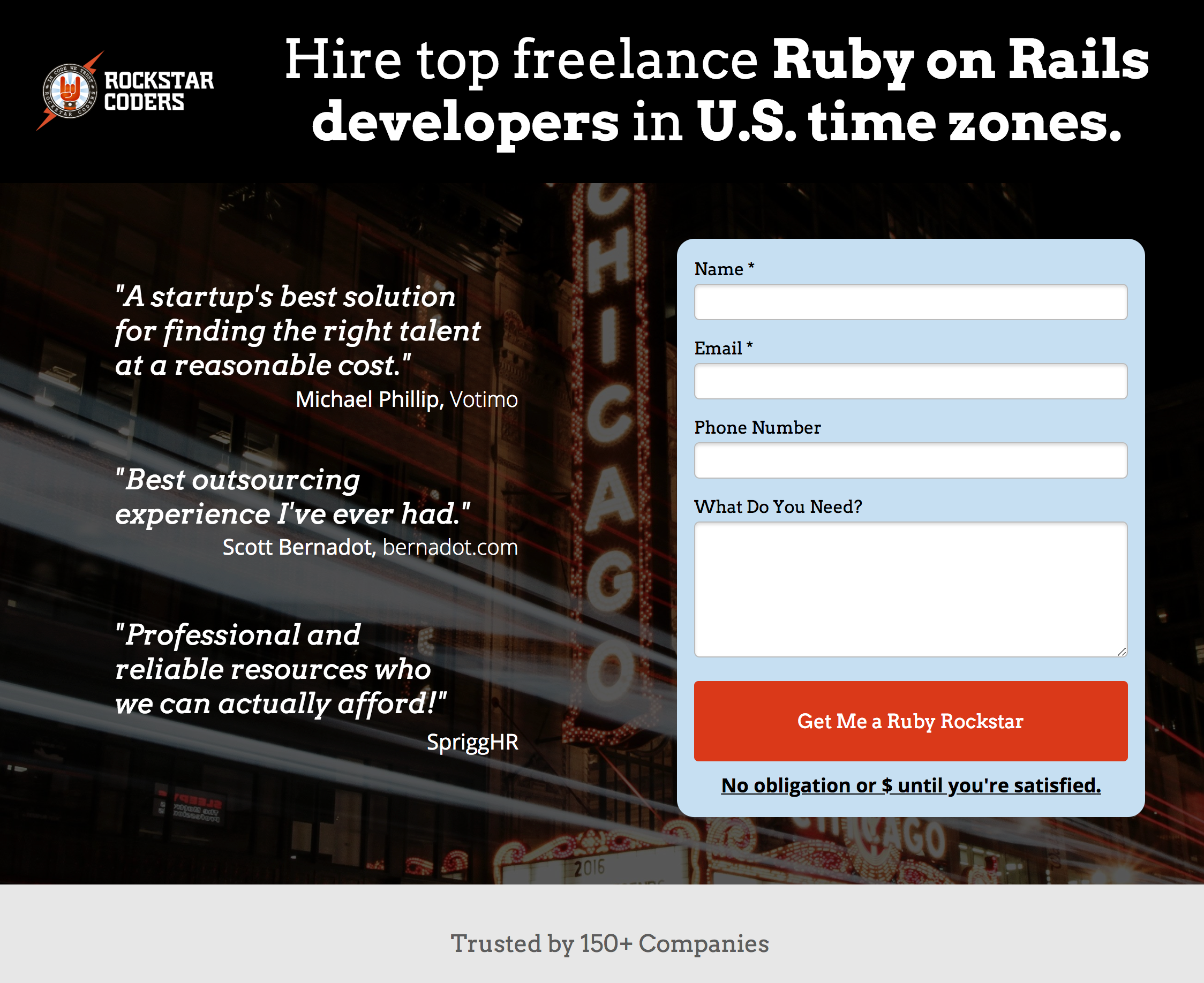
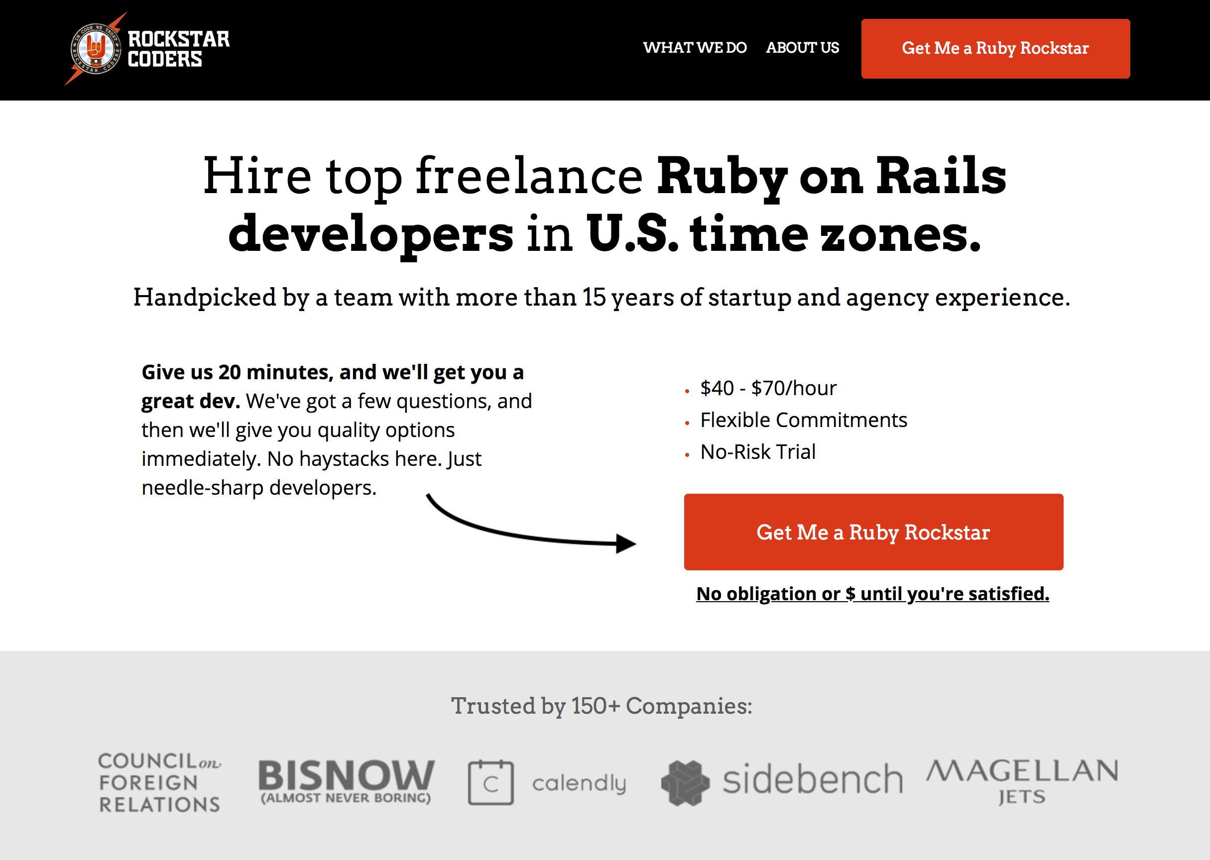
Forms up
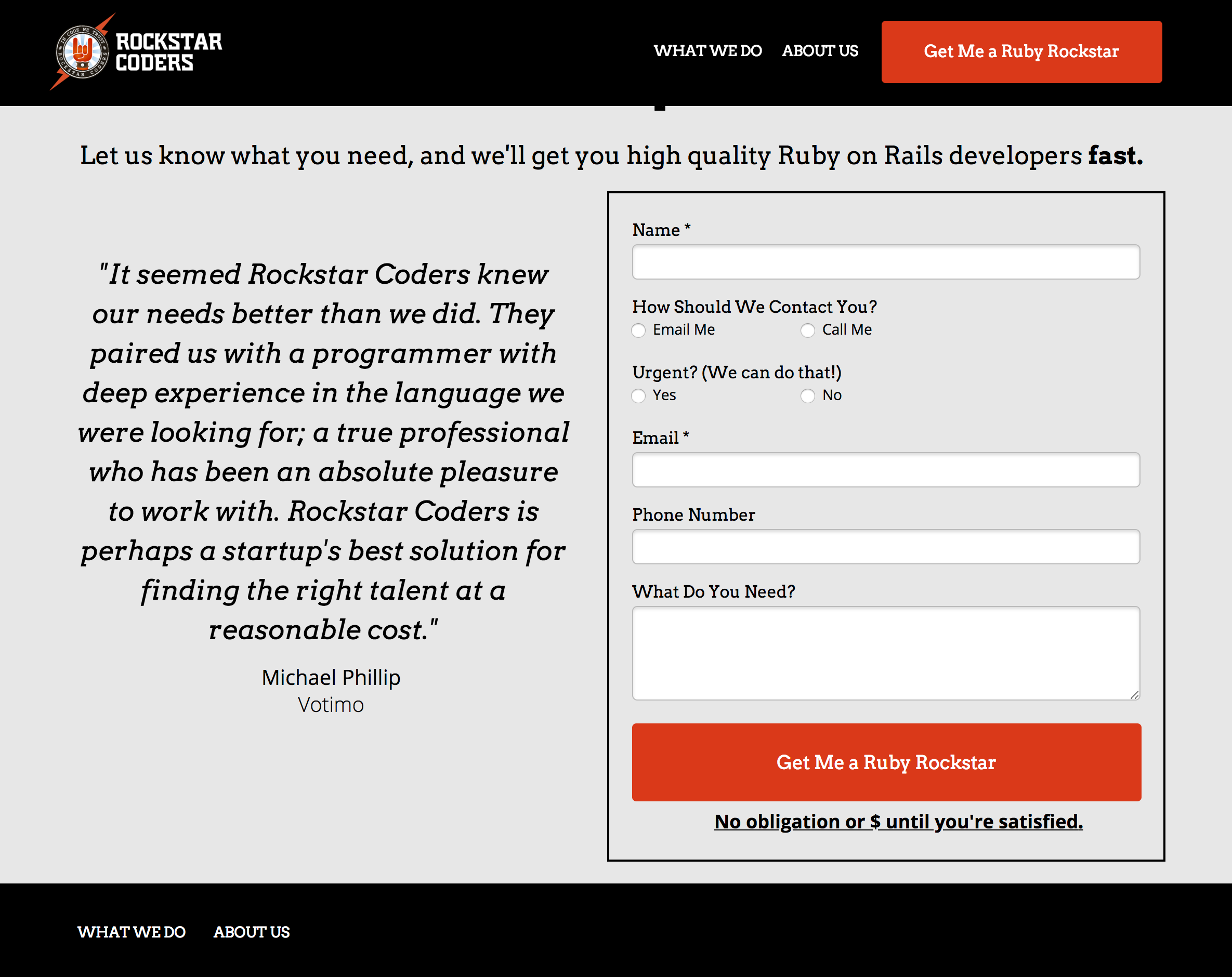
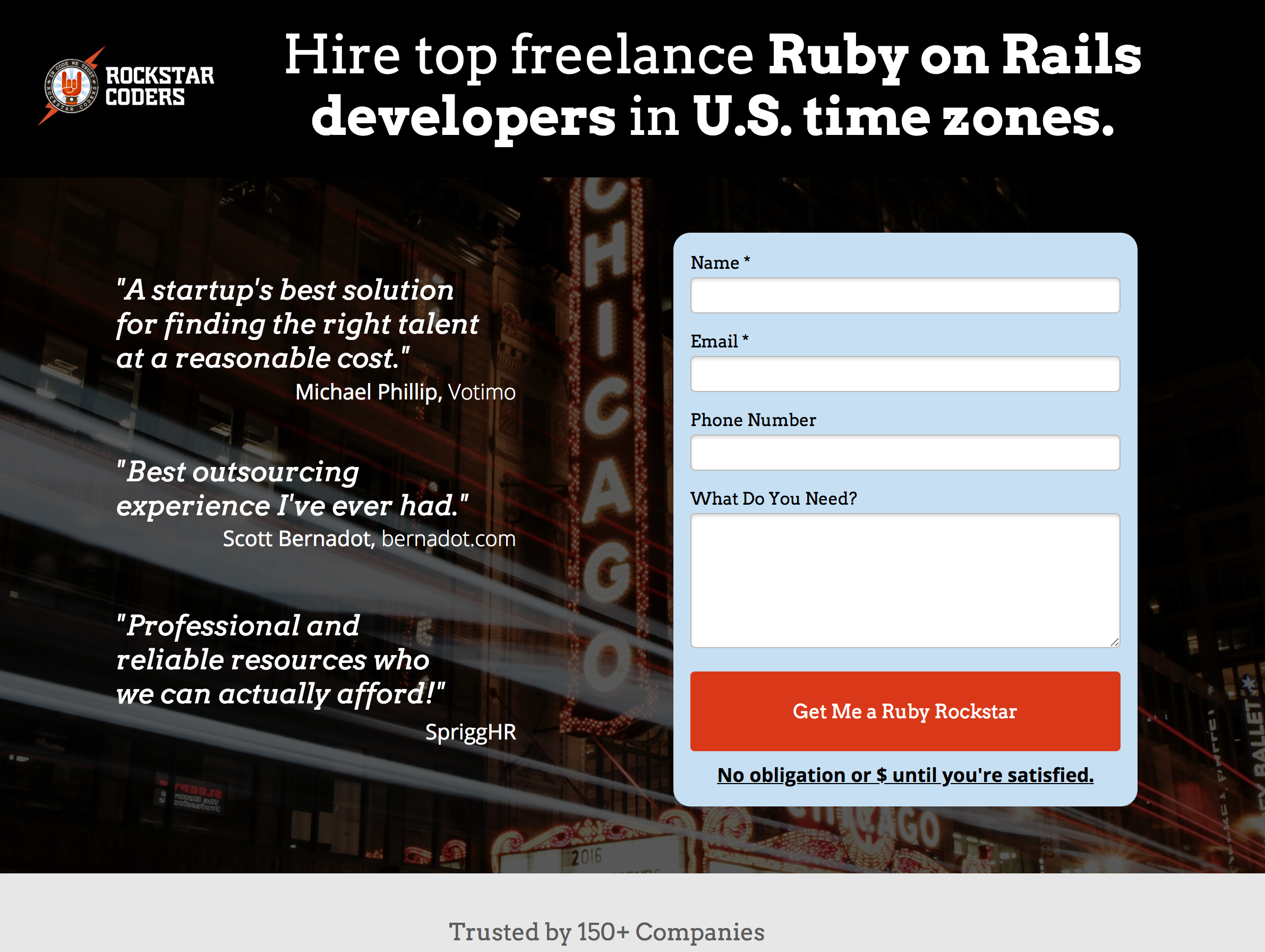
One huge thing I noticed while running Highrise was the impact having a form right up front has. Not on another page. Not at the bottom. At the top. Similar to removing navigation at the top, I want people to stay focused. Let's just get in the door and try things out.
I'm more and more convinced that the longer people read about your product or service the more confused they'll actually become. I don't care how great you are at copywriting. People need to experience things more than they need to read about them to truly understand them.
For example, the best way to convince someone to use your product is actually getting them using your product. Assuming of course your product is great. And the best way to convince someone to hire you is to actually have a conversation with you.
Reading a website isn't a very good conversation.
That especially includes our business. We help people make software. But that means a lot of different things for different clients. For some, it means, "here's some requirements, now please get your team to make this." For others, it means, "please give me a developer for $X an hour and we'll make stuff together." For even others, it means, "I'd like your help hiring someone full time."
And often, people don't know which of those buckets they fall into yet, without actually talking to us.
So instead of trying to get them to discover that through walls of text, let's get on a phone and have a back and forth conversation and we'll figure it out together really quickly.
Getting your form up on the top of the page accomplishes "Hey we're really great and nice people. You don't really need to read further if you don't want. Contact us and we can talk."
Questions down
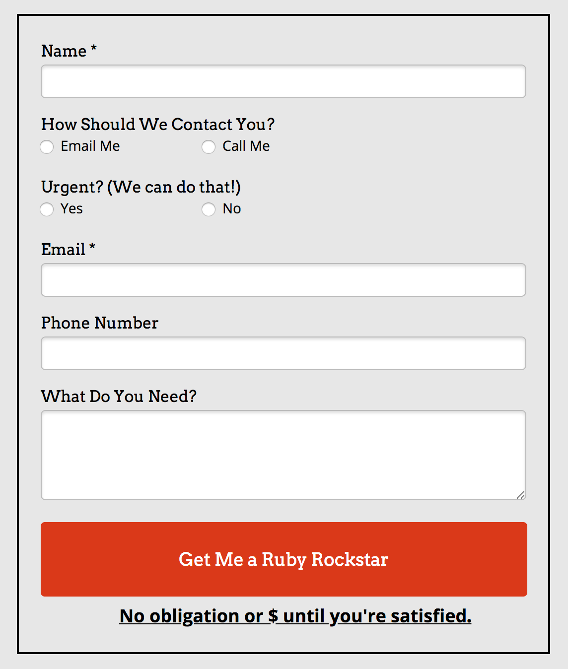
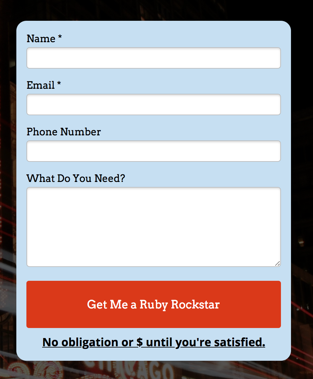
Speaking of forms, people don't like filling them out. That might be obvious, but often we don't take obvious measures to remove that friction. We add more elements to those forms, or make them click around more than needed.
I'm not sure I've ever seen a form conversion rate improve with more questions added. So remove as many as humanly possible. Our old form had 6 questions. Pretty light as forms go. But I think we can remove a couple more. "Tell us how you'd like to be contacted." is a nice gesture. But it's also something we can probably surmise if you bother giving us an optional phone number. "Is this Urgent" also a nice gesture, but in practice we contact everyone back as if it were urgent. So why waste the space on the question?
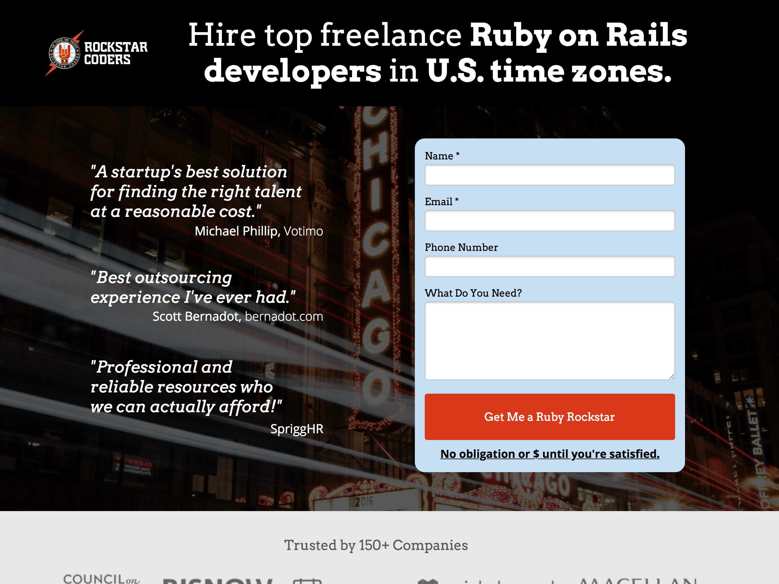
Frame Friction in Social Proof
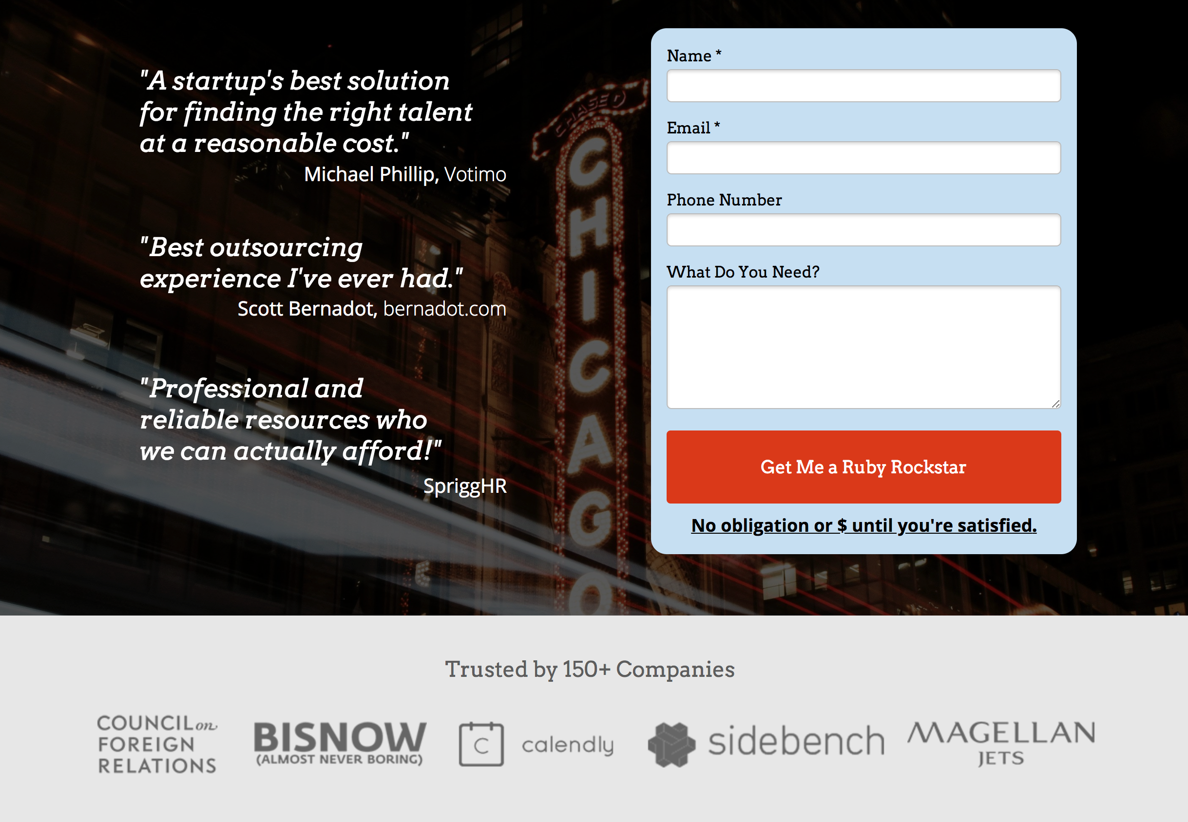
A form is the worst part of your page. It's where your visitor actually needs to make a decision and do work.
And since it's the hardest part of your landing page, that's where I like to spend most of my effort providing social proof.
Our original page had a great testimonial from a customer. But it's just a single piece of social proof.
With the new design, I've surrounded the form with 3 testimonials and our client logos. While someone fills it out now, and their eyes wander, they'll be much more likely to fall onto the words or image of someone else who's filled out this exact form and enjoyed working with us.
Frame the hard parts of your site in social proof.
These are just a few of the decisions I've made. There are many more including how I think about aesthetics and website performance. So please stay tuned for part #2.
Here's a sneak peak. This landing page for Ruby on Rails Developers: has straight A's from WebPagetest and a 100% from Google Chrome's performance inspector.